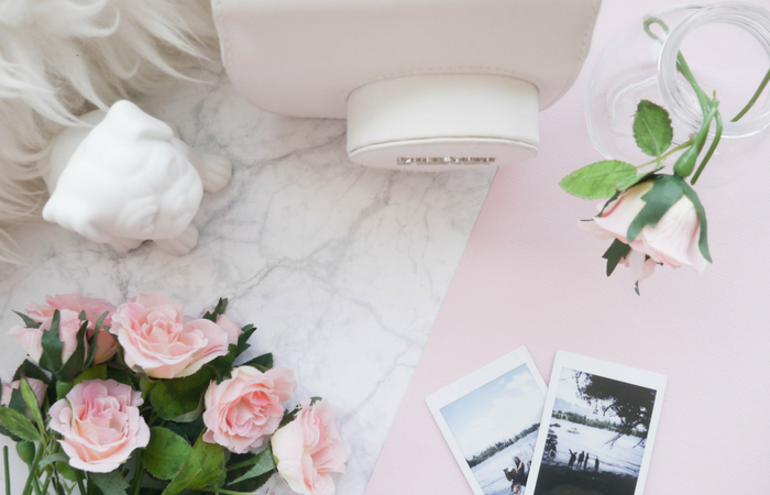
I love photography but am by no means a photography expert. The reason I decided to write this post is because I feel like my confidence behind the camera has grown so much from when I first started blogging to now. In today's post, I'm sharing my four personal tips for blog photography. Here are the things I've learnt through taking my blog photos.
1. Use Less Props
Personally, I find less props a lot more manageable to shoot. Especially in terms of composition. Before I even get my camera out I tend to shuffle the props around quite a bit so having less items in the picture means I can be more flexible with my arrangement. If you're like me and are very particular about the layout of a photo, I think it's a good idea to limit yourself to five or six props per frame so you're not wasting time moving a dozen or so items every time you change your mind about a composition.
2. Take Multiple Shots From Different Angles
Once I've created a prop layout that I'm happy with, I'll photograph it multiple times, adjusting my camera positioning after each shot. Experiment with different angles by constantly moving around your set up. That way, you're not limiting your photos to one reoccurring perspective Flat lays are known for being a blogger's go-to photograph but that doesn't mean you can't play around with other kind of camera shots as well.
3. Photograph Near a Window
Windows are your best friend when it comes to photographing indoors. There's a spot in the house living room that I find myself constantly going back. It gets just the right amount of natural sunlight. When it's hot summer's day, I like to photograph in the late afternoon so the light isn't so intense however if it's cooler outside then I'm more likely to photograph mid day. When it comes to natural lighting, you have to be adaptable. It may not be as predictable as other kind of lighting however it will provide you the best results in the end.
4. Find Your Ideal Editing Program
When it comes to editing my photos, I like to use Adobe Lightroom to brighten my images and then canva.com to crop them to size. There are an abundance of photo editing apps and websites out there, it shouldn't be too hard finding one that accustoms to your photography needs. If you're not happy with your current editing process, don't be afraid to change it up a bit. You want to find an editing program that is compatible with you and your photography style so if something isn't quite working for you, it may be a good idea to try something new.
Thanks so much for reading! If you have any blog photography tips you'd like to share, feel free to leave them below!

These tips are simple but effective
ReplyDeleteThank you for commenting! AnnieChanie
DeleteAs I have just written my own photography post it was so lovely to see what other blogger suggest and have experineced. I liked the less props tip. I think less is more and you are so right abotovercrowding a picture.
ReplyDeleteLea, xx
Thanks for checking my post out Lea! Glad you were able to take something away from it! I really enjoyed your photography post! :-) AnnieChanie
DeleteLoved this post, such great tips. I completely agree with use less props, I hate it when my photos look overcrowded! X
ReplyDeleteThanks so much Mollie! AnnieChanie
DeleteI always take the same shot from different angles, I end up having 100 of the same picture set up just from a different view. Also, I've found less props helpful too, although I like the look of busy flatlays (I just can't shoot them right)
ReplyDeleteKisses and Love
Jazziepickles xo
www.jazziepickles.co.uk
So true! I like the look of busy flay lays, I just struggle so much with too many props! Thanks for commenting! AnnieChanie
DeleteI love that all of these tips are simple, I prefer more minimal shots with less props. And I always take about 100 from every angle before I find 'the one'. Your photos are always beautiful! x
ReplyDeleteSophie
www.glowsteady.co.uk
I'm glad you enjoyed this post! Aw, thank you Sophie! :-) AnnieChanie
DeleteSome good tips here! I read somewhere that for props a good rule to follow is the rule of three. Three props at any one time makes good composition (I think that's the right word). xxx
ReplyDeletehttp://lauralovette.blogspot.co.uk/
Thank you Laura! That's really interesting! I think there's a similar rule in art and design. That would definitely make sense! Thanks for sharing! :-) AnnieChanie
Delete